SUCCESSFUL DYEING
A good deal of the failure of success attending the dyeing of a batik depends on the temperature of the dye-bath. Too hot water will of course melt the wax and a too cold bath will make it so brittle that it will crack in unexpected and undesired places. The accompanying scale of temperatures shows the corresponding degrees of heat on different thermometers. When pure bees-wax has been used the dye-bath can be brought to and maintained at a heat of 110° Fahrenheit, corresponding to 46° Centigrade or 36° Reaumur. If a mixture of paraffin has been used, it is not advisable to have the dye at a higher temperature than 90° Fahr.
TABLE OF TEMPERATURES
| Centigrade | Reaumur | Fahrenheit |
| 30 | 24.- | 86.- |
| 31 | 24.8 | 87.8 |
| 32 | 25.6 | 89.6 |
| 33 | 26.4 | 91.4 |
| 34 | 27.2 | 93.2 |
| 35 | 28.- | 95.- |
| 36 | 28.8 | 96.8 |
| 37 | 29.6 | 98.6 |
| 38 | 30.4 | 100.4 |
| 39 | 31.2 | 102.2 |
| 40 | 32.- | 104.- |
| 41 | 32.8 | 105.8 |
| 42 | 33.6 | 107.6 |
| 43 | 34.4 | 109.4 |
| 44 | 35.2 | 111.2 |
| 45 | 36.- | 113.- |
| 46 | 36.8 | 114.8 |
A fault with amateur dyers is that they often use a great deal more dye than is really needed. By this, it is not meant, that too much solution is used, but too much of the actual colouring matter. One ten cent package of dye will dye a pound of material; some fabrics, such as a light weight silk run about sixteen yards to the pound. To avoid any waste of dye, it is a good plan to prepare a concentrated solution in a small pan and use it with care and economy. Do not add it all at once to the water in the large vessel, but rather make a weak bath into which the piece is put, after having been rinsed in clear water and squeezed out. When the colour is all taken up from the bath, remove the fabric and add more of the concentrated solution. Do this several times rather than impatiently pour in the whole strength; when finally the desired intensity of colour is reached, it will be found that the dyes are faster and a great deal less colour will have been used than would have been the case otherwise. If careful judgment has been used, the water will be practically clear at the end of the proceedings. Another good reason for not using too strong a bath is that with a weaker solution it is much easier to avoid the streaks that annoy the inexperienced dyer. The use of too small a vessel is a frequent cause of uneven dyeing; the material should literally swim in the tub so that no dye can possibly settle in the folds, and for this same reason it is essential to keep the goods stirred the whole time they are in the dye.
After the material has been removed from the dye-bath, it should be rinsed very thoroughly and dried. A large piece can be quickly dried when one knows how. Do not wring it on any account or the wax will be broken in a thousand pieces. Old sheets and towels can be requisitioned with good effect; wrap the rinsed material in these to absorb the heaviest of the moisture and to prevent dripping. If the material is allowed to drain and has not been rinsed properly, the appearance of the dreaded streaks will at once show the reason why the rinsing part of the process is emphasized. When thus “blotted” the material will soon dry when hung over a waxed non-absorbent clothesline; an unwaxed line will sometimes leave a mark where the fabric has touched it.
The material should be thoroughly dry before the second waxing is applied. If an attempt is made to do it while the goods are still damp, it will be found that the wax does not penetrate so well, and consequently, in the second dipping the dye will seep in through the back and spoil the colour which the wax was intended to preserve.
A crackle effect can be produced all over the design by crushing the fabric, more or less gently, according to the amount of colour that one wishes to allow to penetrate, just before the last dipping. A local crackle can be obtained similarly, by crushing only those parts where a broken-up surface to the design, is required.
The occasional use of “crackle” will help the artist a great deal,—for instance, it may happen that one of the light colours in the design may turn out to make too glaring a spot to be entirely harmonious and in such an event one may get pleasing results by deliberately crackling that particular spot and thus tone down its brightness.
Instead of dipping their batik several times, some people paint in some of the colours. As a rule this local application of dyes is resorted to when multi-coloured batiks are desired and when red and blue are used in the same colour scheme. The results of this method of dyeing are not, however, very satisfactory, as it always shows in the finished piece. No matter how small the painted-in spots may be, they always seem to stand out and do not harmonize with the general scheme, the way colours do that have been dyed over each other, as, having been dyed over each other the darker tones are a composite of the colours dyed previously and the whole effect naturally shows a pleasing relationship of colour.
The Javanese occasionally put in their extra colour by this means, but with no greater success than the American artists and the finest craftsmen there are not using the painting process at all.
Another drawback is, that not only are the colours inharmonious, but the moment you try to paint in any large surface, that is, any area bigger than a square inch, the colour is always uneven; this is because the moment the silk is touched with the brush, that individual spot gets the full strength of the dye, which fades out toward the edges and no matter how much patching up is done, it is impossible to get a perfectly even surface such as can be obtained by dipping. Of course, the dye when painted in, is cool and the colours will not be as fast as when the fibres of the material slowly absorb the hot dye. Among other disadvantages, is the fact that the spot which is to be coloured, always has to be first outlined in wax to prevent the dye from spreading; this gives a light outline round a dark surface, which, while not spoiling some designs has an unpleasing effect more often than not.
Batiks in one or two colours are of course much simpler than those in which a variety of tones are required, but with a little thought and practice many colours can be used together on the same piece. The simplest colour scheme consists of an arrangement of yellow, green and blue. Always start dyeing the lightest colour first and work through the colour plan to the darkest shade; for instance, in a piece where yellow, red and black are desired, the dye-baths are arranged in the same order.
In the use of dyes it is necessary to arrange the colour ranges into two groups, which we will call the “group of the reds” and the “group of the blues.” The “group of the reds,” starts with yellow and its variations and hues, then red and variations of red, and lastly purple. The main colours of the “blue group” are yellow, green, blue, and purple. This division of colour will be readily understood by those who have some knowledge of the subject. It will be clear to them that red can be dyed over yellow, and purple can be dyed over red in its turn, whilst it would be impossible to produce a good blue or green on top of a previously dyed red. This same idea holds good in the group of the blues.
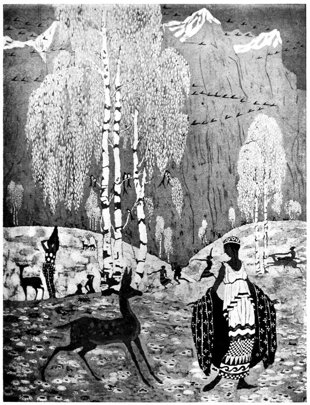
“Spring,” the panel illustrated facing page 64, designed by Bertram Hartman and executed by him and the writer, is one of the early batiks designed by this artist. It was dyed in the group of the blues and no reds were used in the making of it. It was dipped eight times, the original white of the material making the ninth colour. The waxing of this piece was done entirely with the brush, no tjanting being used, and gives a fair idea of the fine work that can be done with the brush, if one considers that the size of the original panel is only about forty by sixty inches.
For some designs it may be necessary to use both red and green in the same piece; in this case the colours of the “blue group” should first be dyed, until the darkest shade called for in the colour scheme has been obtained and then the colour can be extracted from the places where the shades that belong in the “red group” are demanded. With the strong colour extracted, it is possible to get the opposing colours quite successfully, starting in with the lightest tones and working through to the darkest in the manner already described.
This bleaching can be done with a solution of ammonia or washing soda. Both these mediums have to be used with the greatest care as either of them will eat into the wax to a certain extent and consequently allow the next colour to penetrate and affect the previous dyes. It is wise, therefore, to inspect the waxed off parts very carefully before re-dyeing and retouch the places where the wax has been destroyed. A good plan is to keep a strict eye on the wax in any case, in order to prevent surprise attacks by dye on the material through places that have become weakened. Naturally the wax is likely to suffer when the fabric has to be handled as much as it has to be, when being dyed a number of colours.
Some people, when they wish to have opposing colours, such as blue and red, in the same design, resort to the native method of removing the wax entirely after each dipping and re-covering the parts already dyed. This takes a great deal longer and the wax needs very careful dissolving, as the fresh dye will not “take” unless every particle of it is removed from the fabric and even then it is not easy to get a successful dipping as the gasoline used for the dissolving is more or less greasy and of course grease has no affinity with water. White lines, or lines the colour of the original fabric, are apt to show too, if one has overstepped the boundary when covering up the first colour, prior to the second waxing.
When dyeing a batik with one colour over the other, the second colour dyed will always be affected by the tone of the first dipping; for instance, suppose your material is dyed yellow the first time, and blue the second, the fabric will not come out as a true blue, but according to the strength of the blue dye, will be either light green, green blue, or if an intense blue has been used, a blue-green will result. It will be found that similar variations will occur when red is dyed over yellow, which will give shades of orange and gradations of purple will be obtained when red is dyed over blue.
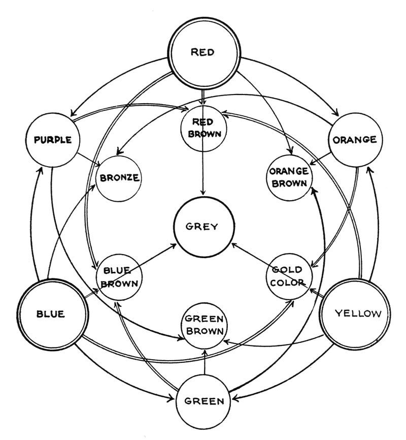
A careful study of the accompanying colour mixing chart will give the reader an idea of the way various shades are produced from the primary colours.
The three primary colours are red, yellow and blue.
Red mixed with yellow produces orange.
Yellow mixed with blue produces green.
Blue mixed with red produces purple.
The orange, green and purple are known as the secondary colours and by mixing either the three primary or the three secondary colours together, grey is obtained. It would therefore be quite possible to dye successfully, with a stock consisting of only the three primary colours, but it certainly would be a waste of time.
For several years the writer worked with five colours, red, blue, yellow, brown and black, and with these produced the various tones necessary in a multi-coloured batik. It is, however advisable to have a few more shades in stock; and with the following selection it is possible to make the widest range of colour in a very short while, and the writer has found that the best results are obtained with the following:
Roccelline 2578J, Natl. Aniline & Chemical Co., Inc., 21 Burling St., N. Y. C.
Orange extra, 2578J, Natl. Aniline & Chemical Co., Inc., 21 Burling St., N. Y. C.
Azo flavine, Bachmeier & Co., 438 West 37th St., N. Y.
Chenoline yellow, Bachmeier & Co., 438 West 37th St., N. Y.
Victoria green, Dicks David Co., 299 Broadway, N. Y.
Acid green, Bachmeier & Co., 438 W. 37th St., N. Y.
Indigotine, Bachmeier & Co., 438 W. 37th St., N. Y.
Oxaline black, H. H. Metz & Co., 122 Hudson St., N. Y.
Alphanol brown B, Natl. Aniline & Chemical Co., Inc.
Magenta, H. H. Metz & Co., 122 Hudson St., N. Y.
Most dyes used in batiking are set with either sulphuric or acetic acid. The above list is all used with the latter, which is preferable, as sulphuric is very dangerous; the slightest trace left in the fabric will, after a while, rot the fibre. Acetic acid does not harm the silk, but with some dyes it is too strong and will change the colour. If this should be the case, either tartaric or oxalic acid can be used. In most cases the acid is added to the bath of the diluted dye rather than to the concentrated solution, the exception being in the case of the Victoria green and the magenta; these have to be dissolved in acetic acid before they are put in the water. Acetic acid is obtainable from any druggist.
Some dyes are set with salt and it is used with many of the household dyes which are always sold with directions on the package. When buying direct from the manufacturers, their chemists will always give the necessary information as to which acids should be used with the various colours.
This book is not intended to be a technical treatise and readers who wish to know more of the chemistry of dyeing are advised to study Prof. Chas. E. Pellew’s “Dyes and Dyeing.”
The tertiary colours are all in the brown tones and the following table may prove a useful guide.
Blue + orange + yellow produce gold.
Red + green + blue produce blue-brown.
Yellow + purple + red produce red-brown.
Green + orange + red produce orange-brown.
Orange + blue + purple produce bronze.
Purple + yellow + green produce green-brown.
It would not be possible to give weights and measures of the different colours, as such specks of colour will change the tone, but any one wanting to mix colours for matching will find that it takes very little time to get a colour once he has decided what the nearest colour is, on the colour chart. By studying this, it is easy to find out what colour should be added to produce any given shade.
The most difficult problem in dyeing is the matching of colours when the materials are different. For instance it is not easy, on account of the difference in surface, to match a charmeuse to a given plush or velvet.
For beginners it is always best to start experimental dyeing by daylight, unless one has a very white light, as the yellow of artificial light takes all, or very nearly all the yellow out of a colour, with the result that where one at night has a beautiful blue, this blue will turn to green in the daytime and lavender will invariably turn grey.
Yellow is sometimes rather a difficult colour to manage, that is to say that if, in a batik the original white of the material is to be used as a background for a design in yellow, it will be very difficult to see where the white finishes and the yellow of the decoration begins. While the material is wet the design will show, but when it is dry, by some mysterious trick of the eye, it has apparently vanished; it is therefore advisable to use a second colour to offset either the white or the yellow.
If, however, a second colour is not desired in the batik and consequently have nothing to offset the yellow, the following hint will save the situation; a little blue or a little red, mixed with the yellow solution, will enable the yellow to hold its own on the white ground. The slightest touch of either of these colours will have the desired effect.
When the colour scheme calls for a yellow and a blue as separate colour units in the design, and the blue is wanted after the yellow dipping, the effect of the yellow on the blue (which produces green) can be diminished by dyeing first, a very weak solution of magenta, over the yellow. Rinse the material thoroughly, then proceed to dip in the blue dye-bath. In doing this, it is necessary to be very careful with the magenta, as it is a very strong colour and an overdose will be liable to produce a purple instead of a blue. Of course, if the original yellow is very intense it is not possible to neutralize it in this way and the bleaching process will have to be used, in order to obtain the blue.
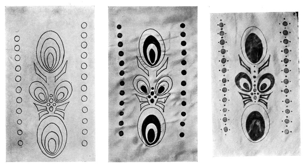
SUCCESSIVE STAGES IN THE MAKING OF A BATIK
And this is another good thing to remember in making a multi-coloured batik which is to have white as part of the colour arrangement. It is always advisable to dye the original white of the fabric some very pale shade, either grey, light tan, pale blue or even pink. If the material is used in its original pure white state, a pleasing effect will never result, as the white will always stand out as a glaring hard spot when it is next to colours that are dyed over each other and consequently blend harmoniously. This preliminary all-over dyeing will “tie in” the white and make it in key with the rest of the scheme.
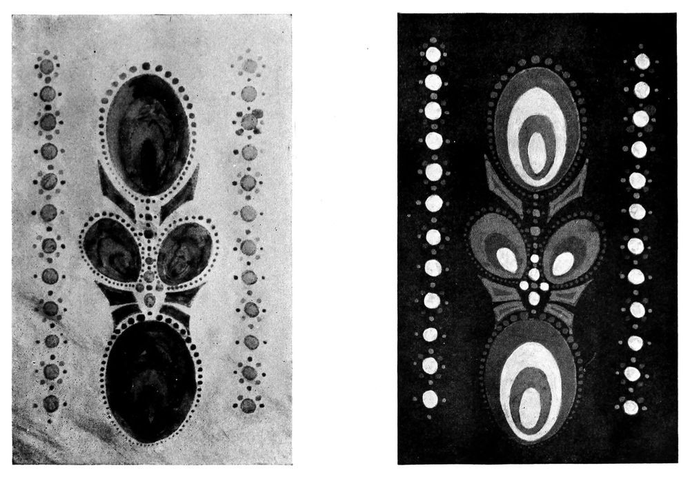
The series of photographs shown here represents the successive stages of a batik in the making. The original fabric is white silk and the first step is the pouncing on, of the design with charcoal, which is then strengthened with pencil. With the tjanting this outline is then waxed (Fig. 1). The spots which are to be white in the completed design, are now filled in with the brush and the material is given its first dyeing, yellow (Fig. 2). Now all the parts that are to stay yellow, are covered off with the wax; when this waxing is completed the material is dipped in light blue, which being dyed over yellow, will produce light green (Fig. 3). After drying, all that has to stay green is covered off with wax (Fig. 4). The final dipping is in red. The last picture (Fig. 5) is the completed piece after the wax has been removed by gasolining; this photograph distinctly shows, in its variations of tone, the different colours that were used.
SUCCESSIVE STAGES IN THE MAKING OF A BATIK